Apparently people who are repeating swear words can keep their hands in freezing water for longer than people who are describing tables.
That muttered curse word that reflexively comes out when you stub your toe could actually make it easier to bear the throbbing pain, a new study suggests.
[..]
“Swearing has been around for centuries and is an almost universal human linguistic phenomenon,” said Richard Stephens of Keele University in England and one of the authors of the new study. “It taps into emotional brain centers and appears to arise in the right brain, whereas most language production occurs in the left cerebral hemisphere of the brain.”
Stephens and his fellow Keele researchers John Atkins and Andrew Kingston sought to test how swearing would affect an individual’s tolerance to pain.
Because swearing often has an exaggerating effect that can overstate the severity of pain, the team thought that swearing would lessen a person’s tolerance.
As it turned out, the opposite seems to be true.
The researchers enlisted 64 undergraduate volunteers and had them submerge their hand in a tub of ice water for as long as possible while repeating a swear word of their choice.
The experiment was then repeated with the volunteer repeating a more common word that they would use to describe a table.
Contrary to what the researcher expected, the volunteers kept their hands submerged longer while repeating the swear word.
The researchers think that the increase in pain tolerance occurs because swearing triggers the body’s natural “fight-or-flight” response.
[..]
The results of the study are detailed in the Aug. 5 issue of the journal NeuroReport.
Two questions:
1. Who pays for these studies?
2. Why do the printed issue dates on magazines almost never reflect the actual issue date (or even the month of issue) of the magazine?
Samuel
July 14th, 2009 at 12:38pm
Trying to work out if the manufacturer’s listed maximum speed is accurate, were we?
A motoring writer has allegedly been clocked driving a $400,000 Ferrari at more than 230km/h on a West Australian road.
Police say traffic officers pulled over 57-year-old Australian Financial Review motoring writer Rod Easdown in the West Australian wheatbelt on Monday.
The V8 Ferrari California convertible he was driving, worth more than $400,000 and reportedly one of only two in Australia, has been impounded for seven days under WA’s tough anti-hoon legislation.
A News Ltd website reported a number of motoring writers were to test drive the car in WA.
Well, that’ll slow down the reviews in more ways than one. (Sorry, I just don’t have anything serious to say about this…the story doesn’t really need commentary anyway).
Samuel
July 14th, 2009 at 10:24am
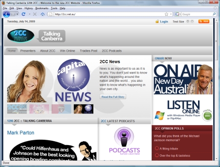
So 2CC have a new website again. I’m starting to have trouble keeping up with the almost annual changes to the layout of their website, but I have to admit that I do like the clean and simple design of the new site, even if I don’t understand what everything on there is supposed to do.
Here’s the new site.

The main difference to the front page from my perspective is the “now, next, then, later” box is gone. I’ll miss that box, but considering that each “now, next, then, later” box was a separate image, I can understand why they would get rid of it…any change to the program line-up would have meant editing at least four images. The “what’s happening at the station” box has been given a more prominent spot, and the “listen live” links are also much more prominent, as are 2CC’s latest podcasts which are also now easier to play, as the page for each podcast has a Flash MP3 player on it.
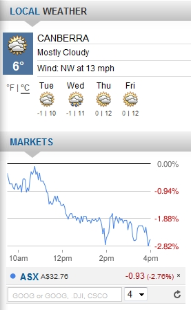
The right-side bar is interesting, as under the opinion poll box they have a weather and stock market box.

I like these, but I haven’t got the faintest clue what the dropdown box on the stock market report is supposed to do. I tried the various options and couldn’t see any difference. I’m sure that it has a function…it’s just not obvious to me. I could ask what it does (I think I will, and report back), but unless it’s blindingly obvious and I’m just thick, it could probably use some kind of description on the page. Other than that, I think it’s great, especially if the aim is to get people to use the 2CC website as their homepage.
Update: I have been informed that the menu relates to how many stocks the graph compares at any given time. If you enter some stocks in to the box next to the menu, they will be graphed. Quite a nifty little feature. End Update
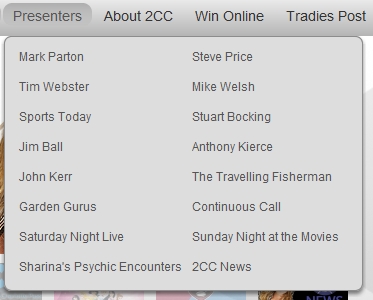
Another improvement is the presenter menu. It easily fits on one screen now rather than stretching to well below the bottom of the screen.

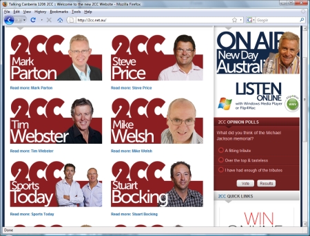
And the presenter page looks good too, having dismissed the 2UE photo backgrounds and only kept the heads of the presenters.

Also of some interest is the fact that the Tradies Post ads have a much more prominent spot and are easier to navigate.
On the whole, I think the new site is great, but there is one thing that I just don’t get. The new site has search engine friendly URLs. For example, Tim Webster’s page on the old site was at http://www.radio2cc.com/index.php?option=com_content&task=view&id=32&Itemid=46 and on the new site it’s at http://www.radio2cc.com/presenters/tim-webster.html and yet for some reason, 2cc.net.au is still one giant frame serving up content from radio2cc.com. If it were me, I’d turn one of the domains in to a redirect rather than doing the horrid frame nonsense. I’d move the whole site over to the 2cc.net.au domain and turn radio2cc.com into a redirect to 2cc.net.au (or, if moving the site isn’t viable for whatever reason, do the opposite). It just doesn’t make any sense to me why, now that search engine friendly URLs are in place, they would want to use frames to hide long convoluted URLs from the address bar.
Samuel
July 14th, 2009 at 07:16am
