Bureau overheat figures by 4 degrees! (2013 was not Australia’s hottest year on record)
The Bureau Of Meteorology released a statement on Friday which claimed that 2013 was Australia’s hottest year on record, with an average temperature of 23 degrees which, according to them, is 1.2 degrees above the long-term average. The numbers just didn’t quite seem right to me as 23 degrees seems like a an average maximum temperature, simply because of the massive areas of the country which struggle to reach 23 degrees during the day for much of the year, and that overnight lows don’t spend much time hovering as high as 23 degrees in much of the country for much of the year.
During the year I had also checked some of the average temperatures in different places against the long-term average and quite often found that while daytime maximums were up (although not usually by anywhere near as much as 1.2 degrees), overnight minimums were generally quite in-line with the long-term average and had occasionally been up, but had also been down on a regular basis.
With this in mind, I decided to check the numbers myself and I’ve gone in to some detail about how I did this below.
But first, what I found was that the average temperature in Australia in 2013 was not 23.0 degrees as the Bureau claimed, but 19.01762629 degrees. The Bureau’s numbers are nearly a full four degrees too hot! This also worked out to be 0.707512656 degrees above the long-term average, not 1.2 degrees as claimed by the Bureau.
Table of the combined minimum/maximum average temperature in Australia for 2013
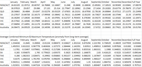
Given the Bureau are basing their 1.2 degrees above average figure on 100-or-so of the oldest weather stations in Australia and my numbers include a bunch of newer stations in addition to the older stations, and there was a general warming trend globally through the 1900s (although not over the last 17 years) it’s possible that my long-term average is higher than the Bureau’s long-term average, resulting in some of the discrepancy between the 1.2 and 0.7 figures…but even then, their long-term actual average temperature should be lower than mine, so the fact that they’re claiming the long-term average temperature is 21.8 degrees proves that either they have increased their historical numbers and 2013 numbers, or their long-term average is accurate but their 2013 number is dodgy and 2013 was actually colder than the average and my numbers think it was above average because Weatherzone’s historical data has been corrupted by manipulated Bureau data. Either way, the Bureau’s numbers are suspicious.
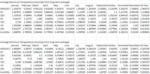
From my numbers, the average maximum temperature in Australia was 25.07590106 (0.909824103 above the long-term average) and the average minimum temperature was 12.95935152 (0.505201209 above the long-term average). The more I think about it, and the more I’m reminded of the ways in which various government weather services and climate researchers have been found to have manipulated numbers to “prove” global warming is accelerating (which it isn’t), the more I think the long-term averages are manipulated so as to be lower than the real number, this making warm years look very hot. Proving it would be another matter entirely, but given the bizarre nature of the differences between the long-term averages I have been using and the long-term averages the Bureau have been quoting, it makes sense.
Table of the average minimum and average maximum average temperature in Australia for 2013
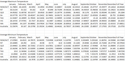
Table of the how far above or below average the average minimum and average maximum average temperatures in Australia were in 2013
Some of my findings did correlate with the Bureau’s findings. For example, the Bureau said:
All states and territories recorded above average temperatures in 2013, with Western Australia, Northern Territory and South Australia breaking their previous annual average temperature records.
I concur that all states appeared to show an increase against the long-term average (bearing in mind my earlier caveat about my doubts about the long-term average data being accurate) and WA, SA and NT were the three most above-average…although whether they set records or not, I can’t say as I wasn’t checking that.
I disagree with the Bureau on another point though.
The year started with a persistent heatwave in January, with Australia recording its hottest day (7 January), hottest week, and hottest month on record.
I have previously demonstrated that the Bureau wildly exaggerated the January heat, but now I have a little bit more to work with.
According to my numbers, January’s average temperature was 24.96473243 degrees (1.023030725 above average), and February was 24.09528836 (0.539000779) above average). This means that January’s average temperature is around 23.9 and February’s is around 23.5. This works out to be about 0.76 above average for the combined months of January and February.
How interesting it is then, that the satellite data doesn’t agree.
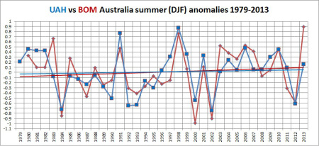
Satellite data plotted against Bureau data. Satellite data obtained from NASA satellites and the University of Alabama in Huntsville. Courtesy of Ken’s Kingdom.
Huge discrepancy…the satellite data doesn’t lie, so the Bureau’s long-term averages are clearly being distorted to make slightly warm years look like a convection oven.
It occurs to me that 21.8C, the average temperature in the Bureau’s press release but not in their weather data, might be the real average and they might be using that in their press releases to avoid anyone running the raw historical numbers and quickly proving it wrong…if so, then 2013 with its average around 19C was actually a below-average year.
The other bizarre thing about the Bureau’s press release is this:
hottest
[..]
hottest
[..]
above the long-term average
[..]
breaking the previous record
[..]
above average
[..]
breaking their previous annual average temperature records.
[..]
persistent heatwave
[..]
recording its hottest day (7 January), hottest week, and hottest month on record.
[..]
exceeded 39°C
[..]
The highest temperature
[..]
the highest temperature
[..]
The January heatwave
[..]
temperatures have warmed
[..]warmest on record.
These are all of the relative references to temperature (eg. “hot”, “warm”, “cold”, “chilly”) from the press release. Notice something missing? Yep, the Bureau completely forgot to mention that there were some cold months as well.
From my numbers:
Nationally, November was below the average temperature.
NSW/ACT: February, April and November were below average
QLD: February and April were below average
SA: November was below average
TAS: April, October and November were below average
VIC: October and November were below average
WA: March was below average
NT did not record a below average month (odd, but not implausible, considering that Northern Australia has not warmed for 31 years)
Additionally, May and June were quite mild months across everywhere except the Northern Territory, and December was quite mild right across the country.
It seems to me that the Bureau have been exaggerating warm weather again while ignoring cool weather, and while I can’t definitively prove that their long-term average temperatures are a work of malicious fiction, I can and have proved that Australia is nowhere near as warm as they claim, and 2013 certainly was not an abnormally hot year.
Update 7:12pm: Satellite data for Australia for 2013 has just been released and it shows that 2013 was an above-average year for temperatures, but not by as much as claimed by the Bureau. Over at Ken’s Kingdom (see link in previous sentence) Ken posits that part of this discrepancy is caused by the scarcity of weather stations in remote inland areas being included in the Bureau’s dataset (a problem my dataset doesn’t have as I used all available weather stations and not just a select group of them) which results in Alice Springs having too much impact on the Bureau’s numbers.
The satellite data (which only goes back to 1979) says 2013 was the hottest on record for satellite data, but given that it was not as hot as Bureau data suggests and there were many years in the early 1900s which were recorded as being hotter by Bureau data than some recent years’ satellite data despite a severe lack of inland weather stations in hot places back then, I maintain that 2013 was not hotter than some of those early 1900s years and was therefore not the hottest year on record). End Update
The method for these findings
The Bureau provide data about daily maximums and minimums, but when I started analysing the data a few days ago they had not released any of the 2013 data, as as I write this they have only released the minimums for 2013 and not the maximums. One could wonder if they’re waiting for public interest in their statement to wane before releasing the data which can be used to check the validity of their statement, especially seeing as the dataset they release only covers about 100 weather stations across the country and all of the records for 2013 are stored in a computer format which can easily be added to the existing dataset.
The fact that only 100-or-so weather stations are covered by the Bureau’s dataset is also troubling as there are more than 700 official weather stations in Australia. The other problem with the Bureau’s dataset is that, to quote them, it is:
a complete re-analysis of the Australian homogenised temperature database [..] and utilises improved analysis techniques.
Given the Bureau’s recent history in claiming temperatures are hotter than they actually are, I can’t be entirely sure that any dataset which they have “homogenised” is going to be accurate and not skewed, so I went for data from an independent source which keeps a note of Bureau data on a minute-by-minute basis: Weatherzone.
Weatherzone pay the Bureau for access to their raw data from weather stations, radars etc and keep track of it themselves. On a day-today basis they use this data to help formulate their own weather forecasts, including for some things which the Bureau does not provide a forecast. More helpfully for this exercise, Weatherzone maintain a bunch of monthly summary pages for each state (eg. this one for Victoria for November), based on the live data they have collected from the Bureau throughout the year. These pages track the average maximum and minimum temperature and rainfall for each weather station in the country.
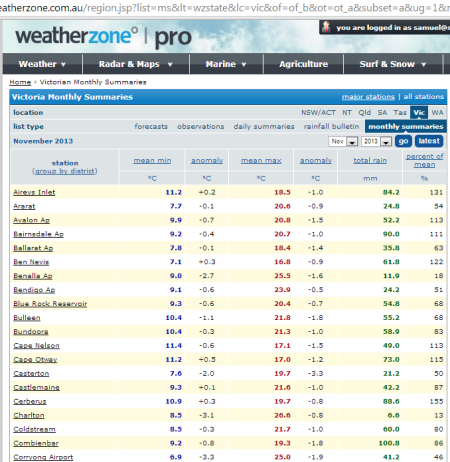
Part of the Weatherzone Monthly Summary page for Victoria for November 2013
If you click on any of the weather stations, you can get a summary for each day showing the actual minimum and maximum of that day, and it is possible to then click on any day and obtain the exact details of the weather in that location at each half-hour through the day. Alas there is no easy-to-download version of this data, so as much as I would like to use the daily minimums and maximums, or the temperature from each half-hour which would be even better, the data would need to be copied and pasted manually in to Excel (and then reformatted slightly to ensure numbers are all on the same row as the name of the weather station), so I settled for the monthly summaries as the average temperatures listed there are what the data from the daily and half-hourly pages would boil down to anyway.
It took many hours of copying and pasting and reformatting, partially because the numbers were pasting below the weather station name and I had to build a macro to move the numbers on to the same row as the weather station name, and partially because whenever Weatherzone’s page detects a record number it highlights it and puts another number in front of it (the number of years which records have been kept at that weather station) and thus I also had to manually go through and remove the year number so that I didn’t have cells claiming that the average temperature in a location was 8,000 degrees or more.
I separated the spreadsheet in to different worksheets for each month, and another one for the overall numbers for the year. Each month’s worksheet was broken up in to sections for each state and territory (although the ACT and NSW were lumped in together).
At the bottom of each state’s data, formulas were run to:
A) Add all of the numbers so that I could quickly check the averages without having to manually add all of the data
B) Using Excel’s “average” function which ignores cells which do not have data (this was vital as some stations could not provide a long-term average as they have been in operation for less than ten years, occasionally a station might not report in a given month, or a station might be start or cease operations in a month and it was quicker to copy and paste the formula between months than to manually build it each each month), calculate the average figure for minimum temperatures, maximum temperatures, difference from long-term average for the aforementioned.
C) Using the calculated averages mentioned in “B” above, average those numbers (as equal weighting is to be given to minimums and maximums) for the combined minimum and maximum.
At the bottom of each monthly worksheet a similar process was undertaken to come up with national numbers, however as there are a different number of weather stations in each state, the state-based averages could not be used for calculations as it would give unfair weighting to smaller states…instead, averages were calculated using every single weather station.
On the “2013 Totals” worksheet, the numbers reached in the above monthly state and national calculations were sorted in to tables to group all of the average minimums and group all of the average maximums etc. To reach a full-year figure for each location, each month was given a weighting equivalent to the number of days in the month so that the annual figure could be truly an annual figure and not be skewed in favour of the shorter months. So, for example, the number for January was multiplied by 31, the number for February by 28, etc, and then the total number was divided by 365.
For anyone who is interested in the raw data (perhaps you would like to see my findings for yourself, or just check out the data for your local weather station), the spreadsheet can be downloaded here.
Samuel
22 comments January 6th, 2014 at 04:13pm
