Wheel Of Fortune Picture
November 18th, 2005 at 09:17pm
Here’s a picture or two circa 2002.
They are pictures of a Wheel Of Fortune set where the contestants are trying to solve a puzzle, the first picture was drawn on paper and was designed as a planning picture.
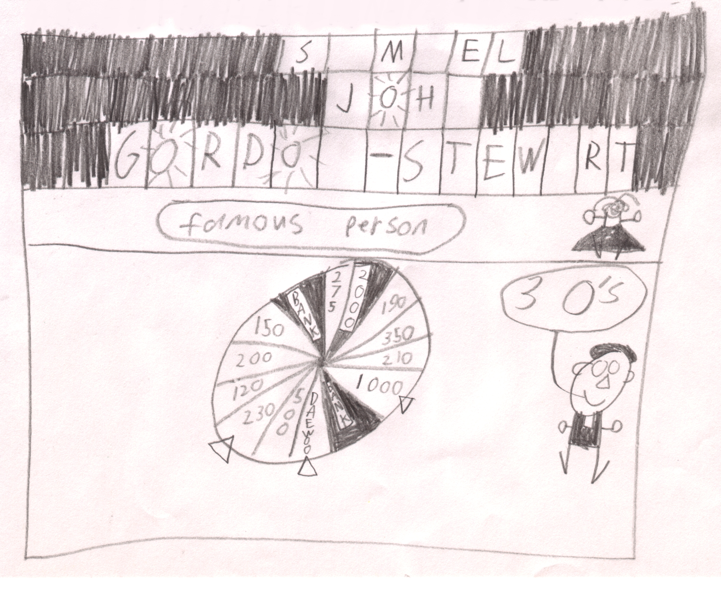
In the picture you can see the puzzle board at the top showing a partially completed puzzle, underneath that you can see the “puzzle genre” graphic and co-host Sophie Faulkner, further down you can see the wheel and host of the time Rob Elliot announcing that there are three “O”s in the puzzle.
The picture was destined to become the cover for my art folder for the art class I was in at the time, and was promptly drawn on there.

There are a few changes in this picture, firstly the picture has colour and the newly revealed letters have a highlighting. The genre graphic has been coloured green to match the TV show’s graphic, and a speaker emitting the sound effects heard on the show has been placed to the left of that. Sophie Faulkner’s dress in now striped. On the far left you can spot two camera operators, one with the camera pointing at the puzzle board and the other pointing at the contestants, who actually appear in this version of the picture. Apart from that, the contestant’s wheel pointers have been coloured to match the TV show. The yellow contestant is requesting “an O for orange” and Rob Elliot is announcing in sentence form “There are three O’s”
In this picture you can see that “Top Dollar” on the wheel is $2000, which means that this was prior to the “inflation” of the money as Rob Elliot called it. This was also at the time when Daewoo were the motor vehicle sponsor of Wheel Of Fortune.
The point of the cover artwork was to identify the owner of the folder, despite the missing letters in the puzzle, it would be fairly easy to identify that I am the owner of the folder.
Samuel
Entry Filed under: Samuel's Artwork

7 Comments
1. troydanger | November 18th, 2005 at 11:08 pm
I like how you make the letter O into a sun. I like the puzzle genre graphic. Just curious. What were you employed as?
2. Samuel | November 18th, 2005 at 11:22 pm
Thanyou, making the O into a sun was a way of making it appear brighter, due to some smudging on the paper the effect worked, although it didn’t come up brilliantly in the scan.
The official title of my job was “Trainee Information Technology Officer” or something like that, although due to staff changes at the beginning of the year I spent most of my time training other staff this year, which was somewhat odd and counter productive.
3. Elle | November 19th, 2005 at 5:53 pm
So now we’re a ‘famous person’ are we? Oh, dellusions of gradeur…….
p.s. Sammy, you do know that your art work sucks, don’t you? Or are you trying for a retro look? It’s not working. My five year old cousin draws better than you do. But then, she’s normal.
4. Samuel | November 19th, 2005 at 6:39 pm
Oh goodness, not one of these “normalness” debates again.
As previously stated, the picture was drawn in 2002 as a cover for a large cardboard folder for my artwork drawn in my art class. The purpose of the picture was to indentify in an artistic way the owner of the folder. As I was drawing a “Wheel Of Fortune” picture (I strongly enjoyed Wheel Of Fortune until Rob Elliot left) I needed to come up with a category for the puzzle, and as I had my own imaginary top rating radio show at the time “Famous Person” seemed like a resonable category…certainly it was a delusion, but it was also a testament to my imagination.
And I quite like my artwork…you might not like it, but look at the controversy “Blue Poles” created, that is just one example of an artwork on which opinions were divided, my artwork is another such example.
5. cunninglinguist | November 22nd, 2005 at 10:55 am
Hey, Samuel, you really are nearly almost famous
http://www.air-news.net/team.shtml
6. meeks | November 25th, 2005 at 6:07 pm
i really believe your artwork is contemporary chic and shows an in-depth outlook of the inflation prices risen in the east. another favourite gameshow of mine was ‘hot streak’, would you also depict the excitmenet and depth in this game show with some wonderful artwork. i would feel so honoured.
i was at the retirement expo just to catch a glimpse of you, but unfortanatly i did not see/ recognise you so our meeting must be postponed for now. forever our souls will entwine, marie
7. Samuel | November 25th, 2005 at 6:19 pm
Yes, Hot Streak was a good show, I really enjoyed it. I might draw a picture of it, but I will need to find a freeze frame of it so I can bring back accurate memories.