Black & Gold change their label design
April 7th, 2006 at 03:41pm
People who shop at Supabarn, IGA, Shoprite and some other stores would be well aware of “Black & Gold”, one of the many generic in store brands which offers products at generally lower prices than their “brand name” competition, other such generic brands are “Savings” as seen in Coles and some independent stores, “No Frills” as seen in Franklins, and “Home Brand” as seen in Woolworths.
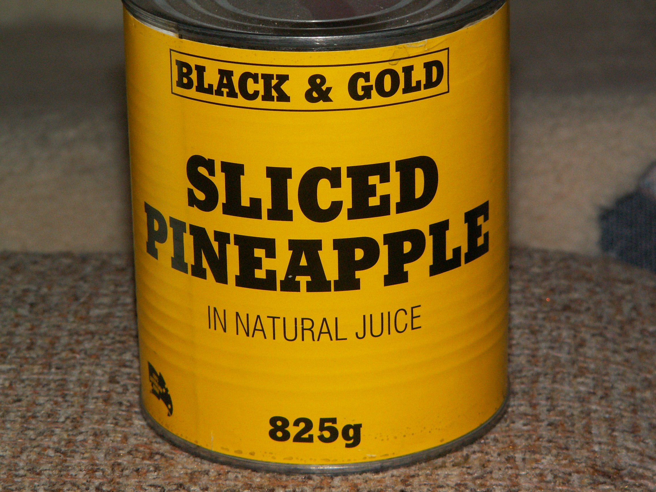
These generic brands often cut down on costs by having very simple, and distinctive labeling, which is usually almost entirely text based. Black & Gold are currently in the process of changing their labeling from their old distinctive “yellow label with black text” design, as seen here:
To this newer design which contains a new coloured logo, a new slogan “Value you can trust”, and a picture which demonstrates the item:

It is quite possible (and probable) that Black & Gold have already made the transition to the newer labeling on all of their products and it is just taking time for the stores to sell off the old stock. I will miss the old simple label design, but the new one is a refreshing change, and gives Black & Gold a slightly more elegant appearance.
It is a good thing that they didn’t remove the yellow background from their labels, as stores would have been fielding complaints from people irate at not being able to find their favourite yellow-labeled products, and would have had to waste staff time pointing people to the new colour scheme.
Samuel
Entry Filed under: General News,Samuel's Editorials

36 Comments
1. heatseeker | April 7th, 2006 at 3:52 pm
You’re always a font of useful, and fascinating, information Samuel … keep up the good work!
2. heatseeker | April 7th, 2006 at 4:09 pm
So, did you buy that bleach just so you could photograph it?
3. Samuel | April 7th, 2006 at 4:20 pm
No, it was already in the household. I would have just taken the camera into the supermarket if I didn’t have examples of both label types at home.
4. Chuck A. Spear | April 7th, 2006 at 4:40 pm
That can is the perfect size and weight to garnish someone’s head with.
5. John B1_B5 | April 7th, 2006 at 4:53 pm
IGA brand coffee is garbage .
6. wonko the sane | April 7th, 2006 at 5:02 pm
I guess with coffee you get what you pay for.
I like the new design, it’s definately more elegant and refined, beautifully understated and minimalistic. I wonder how much it cost to re-do its whole product line?
7. wonko the sane | April 7th, 2006 at 5:03 pm
Although for mine, I think the CAUTION is a little heavy-handed in terms of size. At first glance the shopper might think they are buying a few litres of caution.
8. heatseeker | April 7th, 2006 at 5:23 pm
Do you often embark on label photographing forays in the local supermarket?
Also I don’t think you should refer to the new bleach label as a “refreshing change”, as you may inspire some to crack open the bottle and take a big swig!
9. heatseeker | April 7th, 2006 at 5:25 pm
Good observation Chuck, but I’m more a big rock man myself … although I suppose bleached rocks could be a fashion statement, and a lot more hygenic.
10. wonko the sane | April 7th, 2006 at 5:34 pm
Speaking of Bleach, I was listening to the Nirvana album of the same name the other day. What a classic. The 90s seem like such a long time ago.
11. heatseeker | April 7th, 2006 at 6:54 pm
Perhaps if the supermarket objected to you photographing their labels you could loiter ’round out front and ask shoppers if they would mind if you perused their shopping bags.
Or maybe you could send someone in, buy the said items, photograph the labels in the carpark and then take them back and get a refund …
12. Chuck A. Spear | April 7th, 2006 at 7:01 pm
Great idea heetseeker. Samuel could do it undercover wearing an Editorial Echoes tshirt. He could ask shoppers their opinion on the label change using his digital note taker and relay their opinions back to us.
I do hope however, that the bleach will be used for cleaning and not for home made bombs. Can you get B&G fertiliser?
13. heatseeker | April 7th, 2006 at 7:54 pm
Yeeeeeesssss .. I was wondering what mischief Samuel was indulging in with the black and yellow gear – particularly that big tin of pineapple pieces.
But I agree, a consumer report on the label change would be of great interest, and perhaps Lawsie and Gloria would pick it up and run with it (you never know, Black and Gold might be able to come up with some cut price “financial arrangement”).
Mmmm, but I do wonder if there’s black and gold fertiliser, and if Samual has been stashing it 2kg at a time on his many “walks” with Nattie.
I would have to put two and two together if ever an Action bus disintegrates with all its passengers … you have to wonder how many disciples have been groomed for such a task through the hypnotic, apparently random, check pattern of Samuel’s “artworks”.
14. Chuck A. Spear | April 7th, 2006 at 8:12 pm
Well Samuel does not like green ACTION buses or the lunatics that ride on them. He prefers the orange ones. Now I know for a fact that on the green buses, the passengers turn up their walkmans so loud it drowns out the drivers AM radio. Such naughtyness does get on Samuel’s goat and he gets a rather nasty bee in his bonnet.
Should we be calling any hotlines heatseeker?
15. heatseeker | April 7th, 2006 at 8:19 pm
I say hang off on any calls – be alert, not alarmed!
I’m more concerned at what he going to get up to with that 825g tin of pineapple pieces … what the hell is he planning – a Carmen Miranda tribute night?
16. wonko the sane | April 7th, 2006 at 8:32 pm
I love this site.
17. wonko the sane | April 7th, 2006 at 8:35 pm
I’ve also noticed an increasing amount of yellow and black coloured squares appearing in Sam’s artwork heatseeker. Could this be a subliminal hint towards other black and yellow symbolism, such as the radioactive waste signs? Does SGS have nuclear capability?
Should we send for Hans Blix?
18. heatseeker | April 7th, 2006 at 9:06 pm
I’m sure Hans could probe Alan Jones while he’s at it!
19. wonko the sane | April 7th, 2006 at 9:08 pm
Do Hans and the Parrot have history?
20. Chuck A. Spear | April 7th, 2006 at 9:11 pm
I could see Samuel in a tutti frutti hat and a ruffled skirt heetseeker.
I think Samuel may have the scientific know how when it comes to splitting the atom Wonko. Shopping baskets as streetlights aside, I would not drink from the water of Lake Burly Griffin. God knows what diabolical scheme will be unleashed on the masses.
I can only hope and pray that more clues are left in Dlognwot.
21. Chuck A. Spear | April 7th, 2006 at 9:12 pm
I will not comment on Alan Jones. I do not widh to get into by hot water.
22. Samuel | April 7th, 2006 at 9:25 pm
Reading through those comments…I don’t think I’ve laughed so hard in quite a while.
23. Chuck A. Spear | April 7th, 2006 at 9:29 pm
Well I have had to go and put on my sword and magic helmet Samuel. I must protect myself.
24. heatseeker | April 7th, 2006 at 9:46 pm
I’m breaking out the tin foil as we speak …
25. heatseeker | April 7th, 2006 at 9:48 pm
Chuck, I’m more concerned with his ability to split the pinapple pieces …
26. heatseeker | April 7th, 2006 at 9:49 pm
Of course my tin foil will be Black and Yellow – preferably with the new branding!
27. Chuck A. Spear | April 7th, 2006 at 9:59 pm
I have put in a call to Premier Beattie. He is placing an armed guard around the Big Pineapple as we speak.
Colour co-ordinated foil helmets are the only way protect oneself. Even though Wilde said that ‘fashion is a fickle mistress’ and ‘fashion is so bad it must be changed every six months’ I think it is necessary in this case.
28. Chuck A. Spear | April 7th, 2006 at 11:11 pm
Damn code monkeys. I just had a nasty accident. I accidently stapled a 2CC poster to my forehead. I usually have embarassing sticky tape moments but this has put me in a bind. I am dictating this post as my other index finger is stuck in a Kilkenny can because i was trying to retrieve the widget. I needed the nitrogen for my billy cart.
Oh the humanity!
29. Chuck A. Spear | April 7th, 2006 at 11:15 pm
I have to add, regrettably, that Egyptian Crocodiles are also snapping at my feet.
30. wonko the sane | April 8th, 2006 at 12:27 am
Speaking of cut price, my mum used to buy those horrible chalky Sunshine brand biscuits when we were kids. They cost 79c a packet back then, but even at that ridiculous price we were only allowed a limit of one per day.
One day I copied her handwriting on her shopping list, writing ‘chocolate’ in old fashioned nana writing and she actually bought some.
That was the highest achievement of my life. It was all downhill from there.
31. wonko the sane | April 8th, 2006 at 12:42 am
I’m not that surprised to note that B&G went for a Helvetica font for the redesign. It seems to be the flavour of the month lately.
Not around these parts though — Sam sticks with the Studio 54, Boogie Nights style, classic, friendly script fonts and sometimes circus fonts. I like it. He could bring about a circus font revival in the main stream press, get everybody talking circus and then BAM, tonnes and tonnes of radioactive pineapple chunks into Lake Burley Griffin.
32. John B1_B5 | April 8th, 2006 at 8:06 am
An interesting selection of ROCKS can be seen here –
http://groups.msn.com/Australia-TheLandDownUnder/bugswatter.msnw?action=ShowPhoto&PhotoID=29959
33. cunninglinguist | April 8th, 2006 at 8:38 pm
Oh my giddy aunt. Samuel, keep posting these sorts of entries, the comments you end up with are fantastically funny!
I am so laughing my bottom off at these nutty nuts 🙂
34. heatseeker | April 10th, 2006 at 10:49 pm
Wonko, you’d have to ask why that big tin of pineapple pieces doesn’t have a very large “caution” disclaimer on it … perhaps it will be rectified in the new system …
35. heatseeker | April 10th, 2006 at 10:54 pm
Although, getting back to the subject at hand, if I pay cut price, I expect a very dodgy utilitarian label.
I’ll see if I can get through to Lawsie and discusss this tomorrow … Gloria sems to be too busy of late trying to stir up the next Cronulla riot.
36. cunninglinguist | April 11th, 2006 at 10:56 am
Pissing myself laughing here. Hilarious!