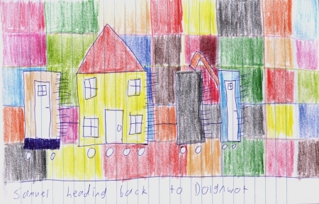
Samuel In Dolgnwot Revitalisation
April 22nd, 2006 at 12:10pm
Often scanned images have a tendency to look “washed out”, and the Samuel In Dolgnwot pictures are no exception, as can be seen in the scanned version of series two, episode three.

I have been manually attempting to fix this with some tweaks to the brightness and contrast, which works to an extent.

However GIMP has a most useful feature which is designed to fix up the colours on scanned images automatically (it can be found under “Layer–>Colors–>Levels” and click the “Auto” button (Yes, I know, American software with American english). It does an excellent job.

I have now gone through and fixed up all of the Samuel In Dolgnwot images, and as such, they are now much more like the drawings, and much more lively.
Samuel
Entry Filed under: Samuel In Dolgnwot

3 Comments
1. wonko the sane | April 22nd, 2006 at 3:19 pm
Wow, that’s a startling difference Sam. The revitalised picture is so vivid. Pure colour itself pales by comparison… it’s almost unnatural. Like a genetically-engineered tomato that’s been designed to taste more like a tomato than a tomato itself.
Is this intentional, I wonder? Is this a veiled message being spoken through Sam by some pan-dimensional being, perhaps a subtle, powerful spirit? By creating a colour that is more red than red, it’s almost saying that God’s own creation is inferior and imperfect, that man, in his pride, can improve on nature.
Perhaps I am reading too much into this…
2. heatseeker | April 23rd, 2006 at 6:37 am
I like the enhanced image .. it only makes my Dolgnwot experience all the more vivid!
3. Chuck A. Spear | April 23rd, 2006 at 9:19 pm
They do look much better and more real.