I might be alone on this, but I think it looks good
February 28th, 2013 at 03:27pm
Fairfax’s Drive.com.au had a story a few days ago about the new Jeep Cherokee. Apparently people don’t like the look of it.
“Kill it with fire”, “epicsupermegafail face”, and “the catfish”.
Those are some of the harsher critiques that greeted Jeep’s “bold” new Cherokee on automotive websites around the world within hours of its unveiling.
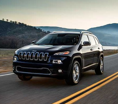
The all-new mid-size SUV features polarising styling, with the recognisable seven-slot grille sporting a prominent horizontal crease through its centre. Slimline headlights and larger, squared-off fog-lights and a thick, angular front bumper
(h/t Matt Campbell, Drive.com.au)
So, what does is actually look like?

(image credit: Drive.com.au)
I quite like it. I’ve never owned (or even driven) a Jeep, but I’ve always liked their bold styling and the fact that they have been unafraid to have a tough looking vehicle while the rest of the market tried to look softer and smoother. This, I think, holds true to that tradition, just with a tiny bit of ensuring that they vehicle doesn’t look out-of-date.
I’m not entirely convinced that those tiny headlights would pump out enough light…but then again I have been surprised by how much light can come out of very small lights.
Am I alone on this? Am I the only person other than Jeep employees who thinks this looks good?
Samuel
Entry Filed under: Samuel's Editorials
